AI for accessibility: bringing Ally to Meta Ray-Ban
Client: Envision AI
Type: In-house full-time role
Role: Product Designer (UX/UI)
Year: 2025/26
Type: In-house full-time role
Role: Product Designer (UX/UI)
Year: 2025/26

Ally (30k+ downloads) is an accessible AI assistant that helps people from the blind and low-vision community read texts, describe images, check their calendar, and navigate daily life more independently through voice. As a Product Designer at Envision AI, I designed the integration of Ally with Meta Ray-Ban glasses (now in private beta with 10k testers), opening a new customer acquisition channel and reinforcing Envision's mission of making AI assistance available across hardware. I also strengthened the design system by auditing components for inconsistencies and improving color contrast to meet 100% compliance with WCAG accessibility.
For blind and low-vision people, tasks like reading a label or checking the arrival board at the station require extra effort or help from others. Ally removes that friction, putting an AI assistant in their hands that assists them in these kinds of tasks. The app supports hardware integrations with the Ally Solos Glasses (the newest Ally native smart glasses model) and the Envision Glasses (older model, born as a standalone device), allowing users to interact with it hands-free. The new Meta Ray-Ban integration meets users on an hardware they already love, opening a new significant customer acquisition channel.
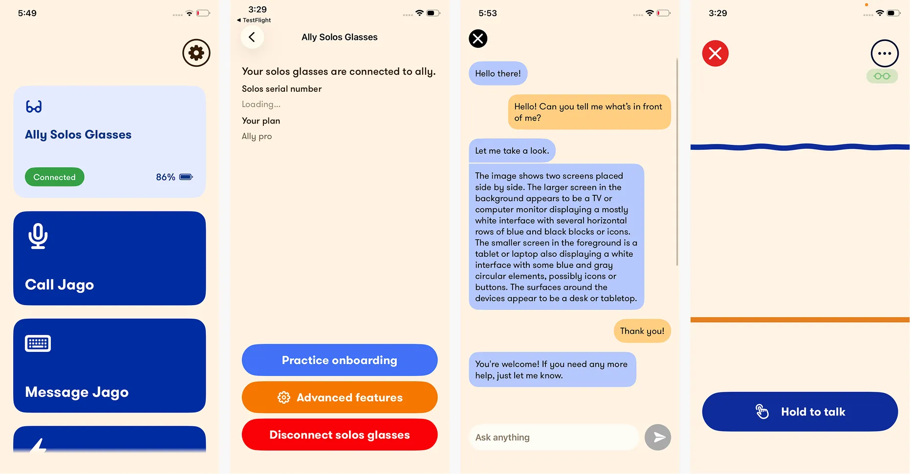
Screens of the Ally app when I first arrived at Envision
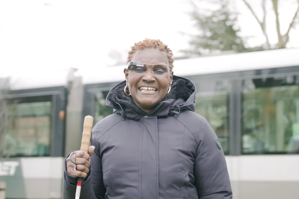
User wearing the Envision Glasses
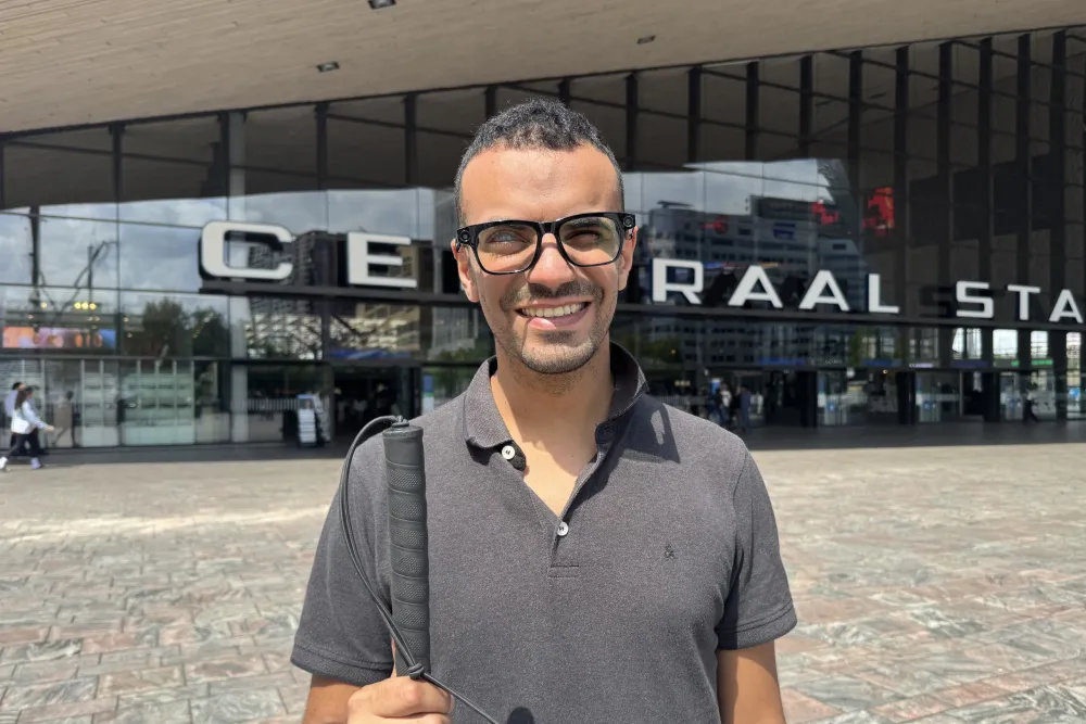
User wearing the Ally Solos glasses
Design an Ally integration for the widely used Meta Ray-Ban glasses, ensuring the experience is consistent with the app design and meets the high accessibility standards a blind and low-vision audience depends on.
Potential
The Meta Ray-Ban glasses are already part of daily life for many people in the blind and low-vision community, making their integration with Ally a natural next step to reach new users on hardware they already trust.
Early tensions
Unlike the existing Solos and Envision Glasses integrations, connecting Meta Ray-Ban requires users to navigate through the Meta AI app multiple times during pairing. This can potentially create unintentional error states and confusing transitions. Since the feature had been technically built prior design intervention, I mapped the existing flow identifying UX inconsitencies and edge cases.
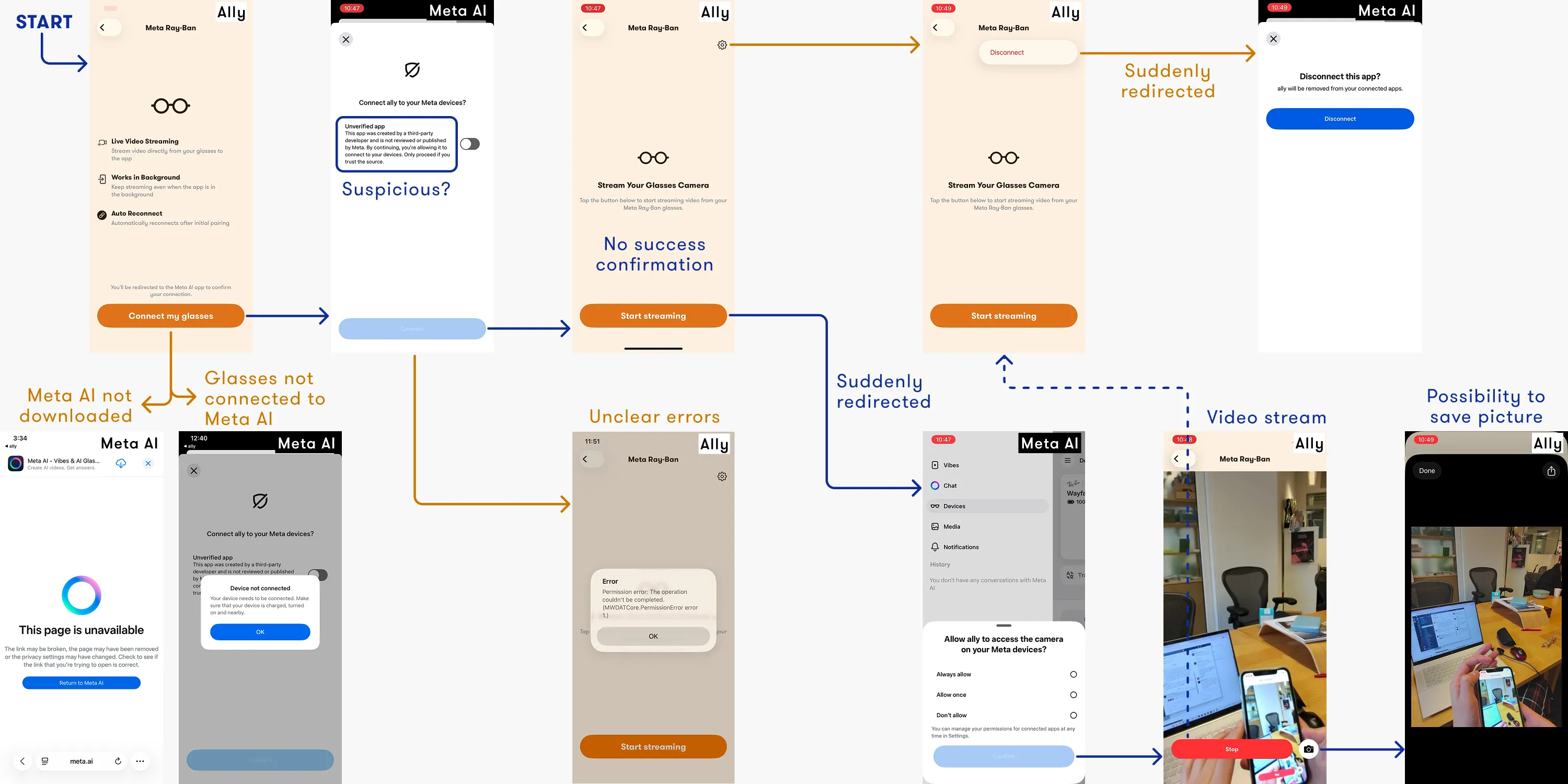
Overview of the flow before design intervention
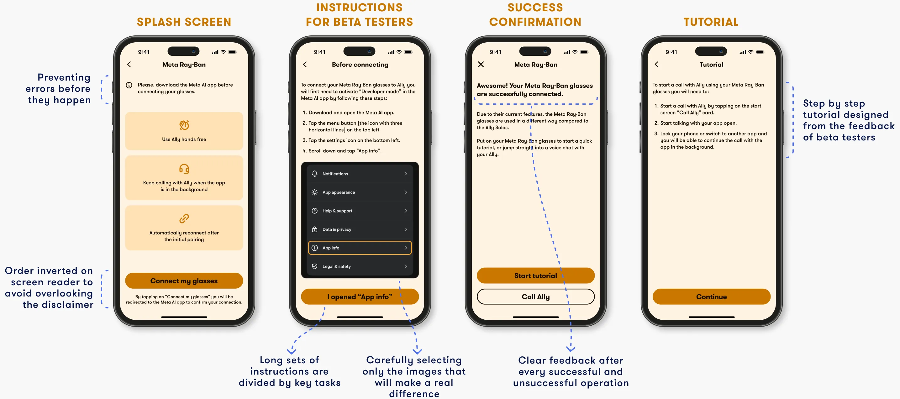
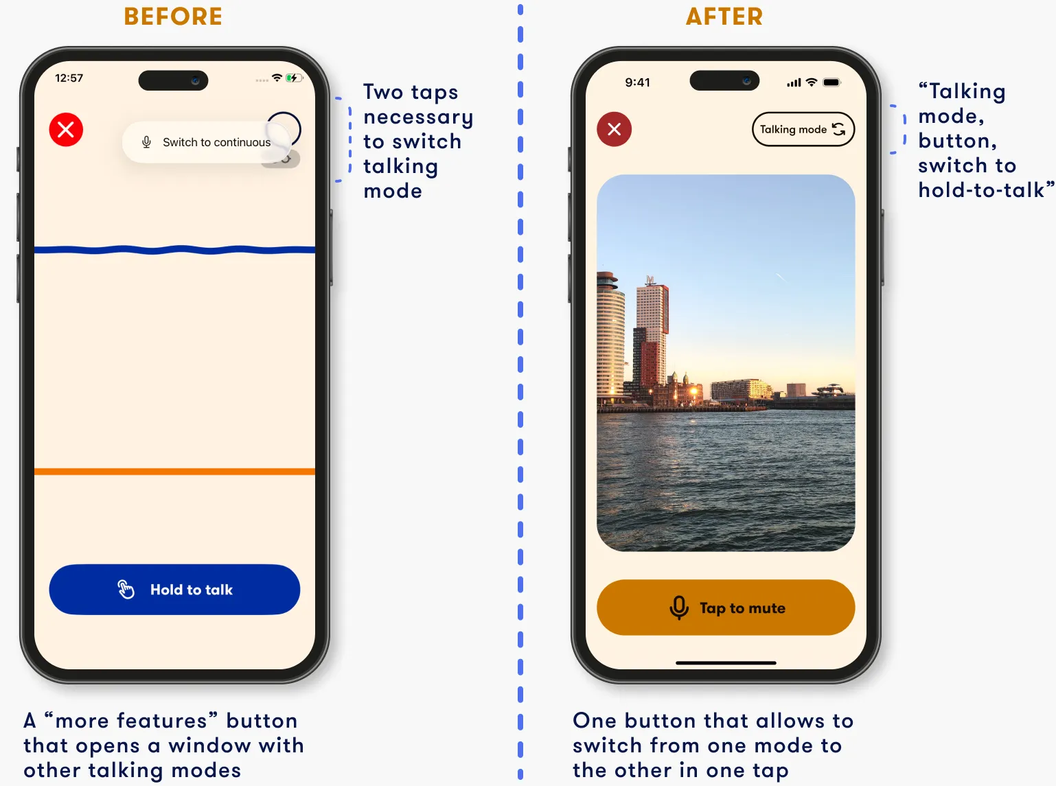
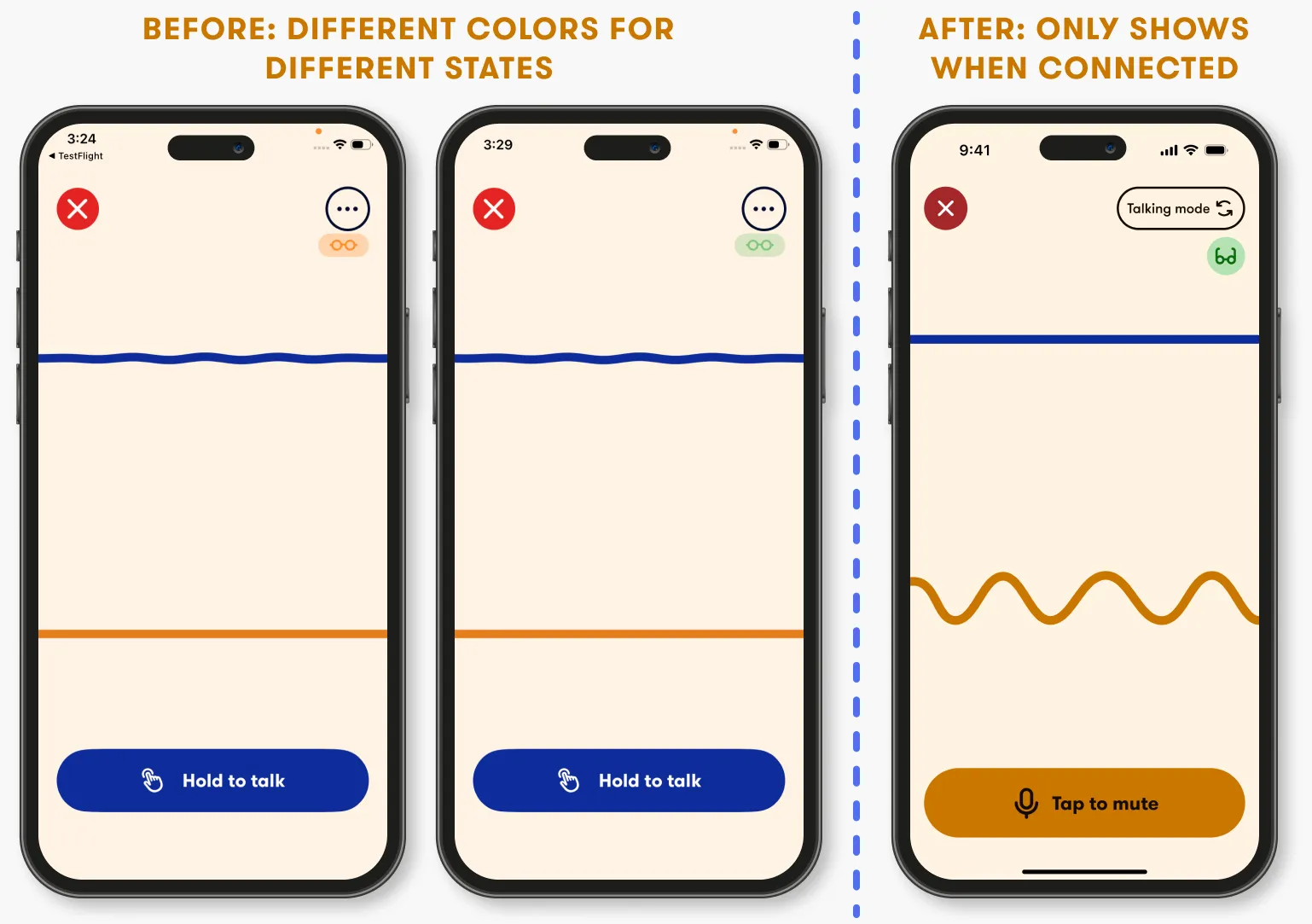
Connecting the Meta Ray-Ban glasses to Ally requires navigating through the Meta AI app multiple times, an interaction pattern that, without context, can be very disorienting. Given that most Ally's audience navigates the app through a screen reader, the challenge was to create clear instructions that make the flow feel intentional without using images. To do so, I used copy proactively, carefully balancing what screens display visually and what the screen reader reads aloud, refining word by word thanks to the feedback of beta testers.
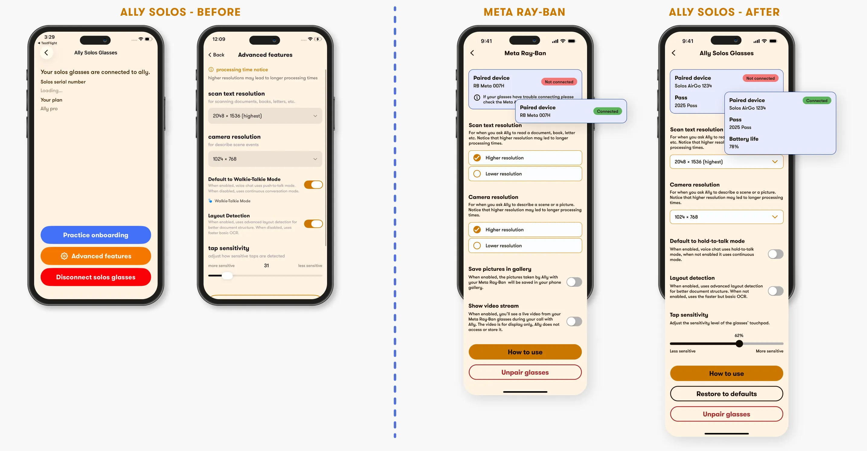
The Meta Ray-Ban glasses have different options than the Solos, and the existing settings structure didn't accommodate them cleanly. Rather than forcing the new options into an existing pattern, I redesigned the settings page from scratch. The result was better aligned to the app's system and faster to navigate, so I applied it back to Solos, mindful of the differences between the two.
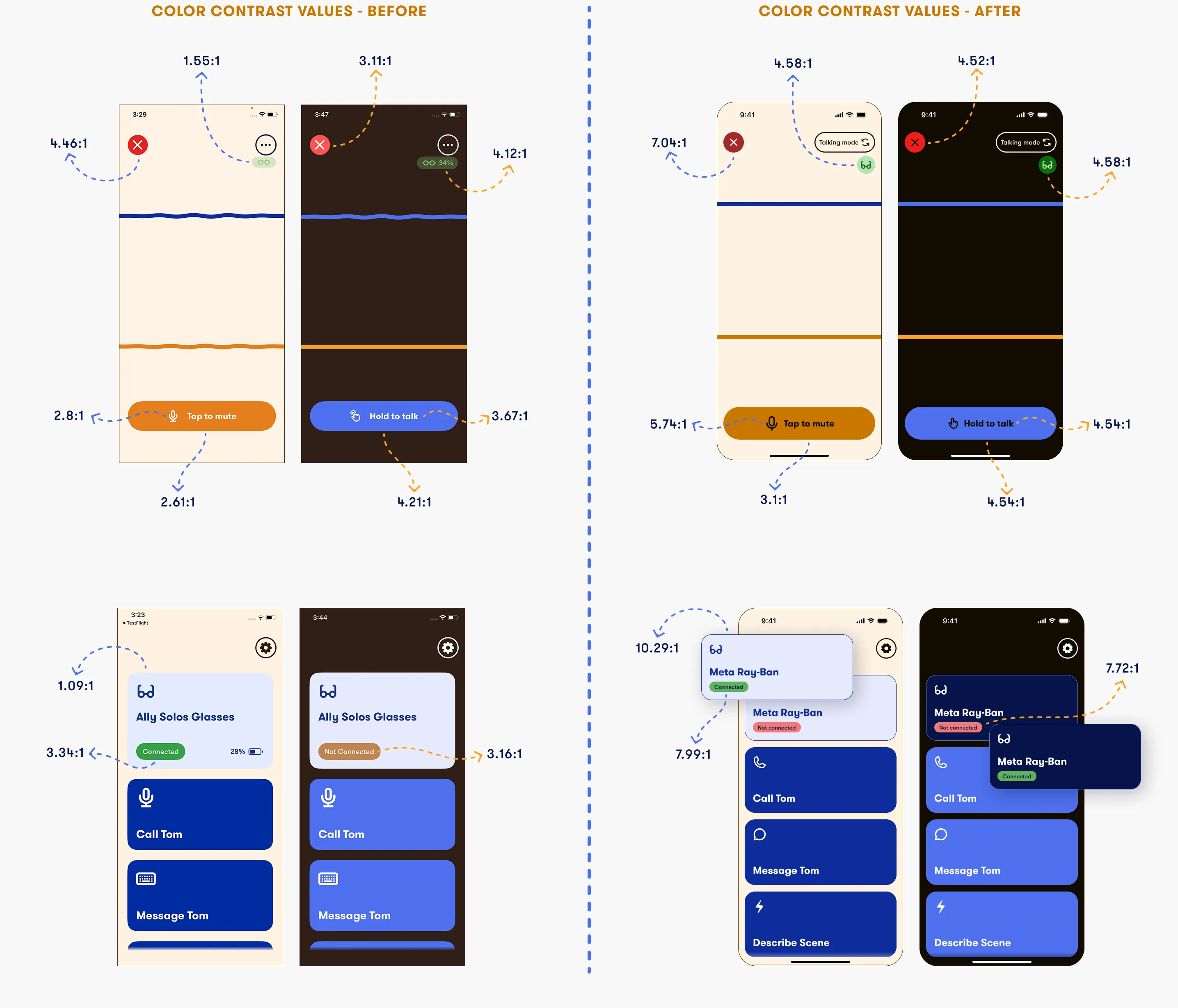
Designing a new feature in an existing product is an opportunity to look at the rest of the app. With the Ray-Ban integration, I audited the design system for accessibility gaps and I fixed them across the whole app. This resulted in reaching 100% compliance with WCAG standars both in light and in dark mode.
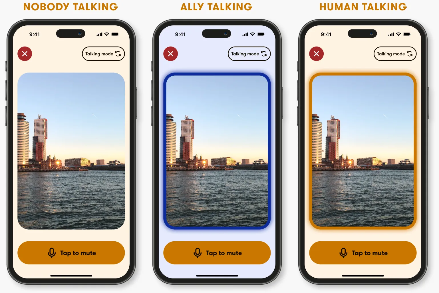
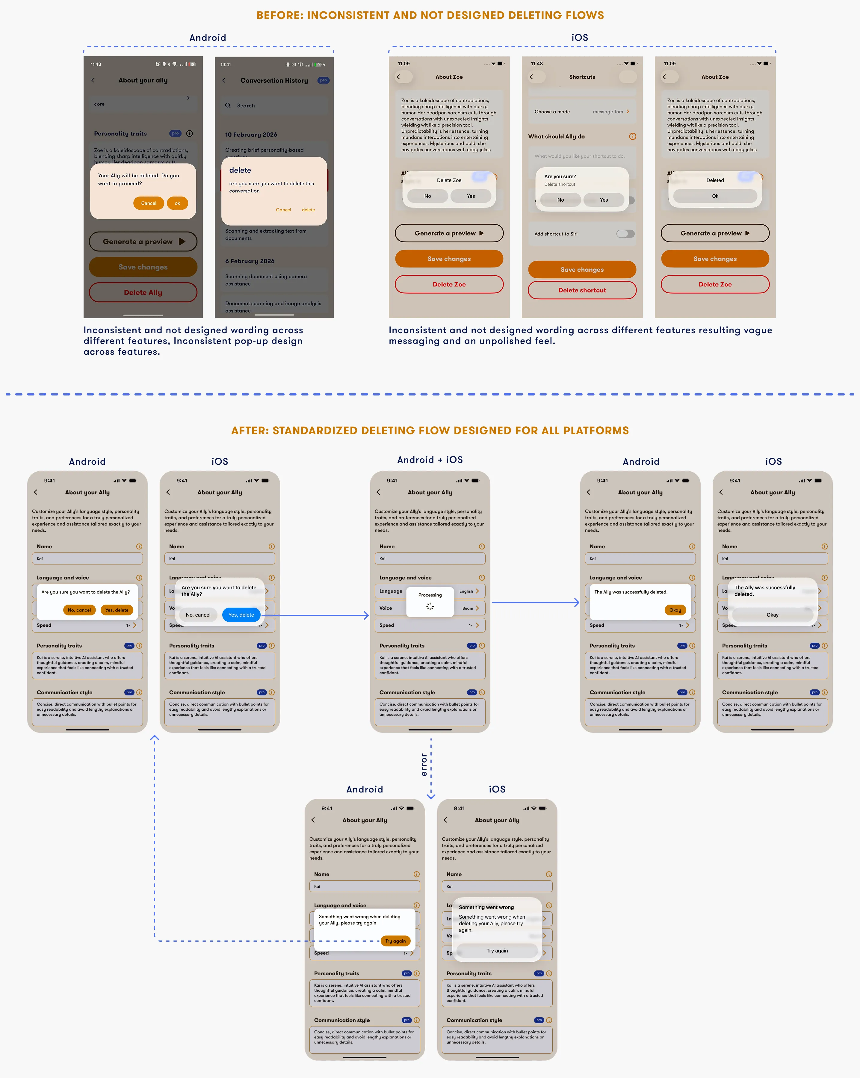
Additionally, save, delete and unpair flows were inconsistent across the app and in some cases not designed at all. I redesigned and standardised these flows, applying a coherent pattern across the whole app.
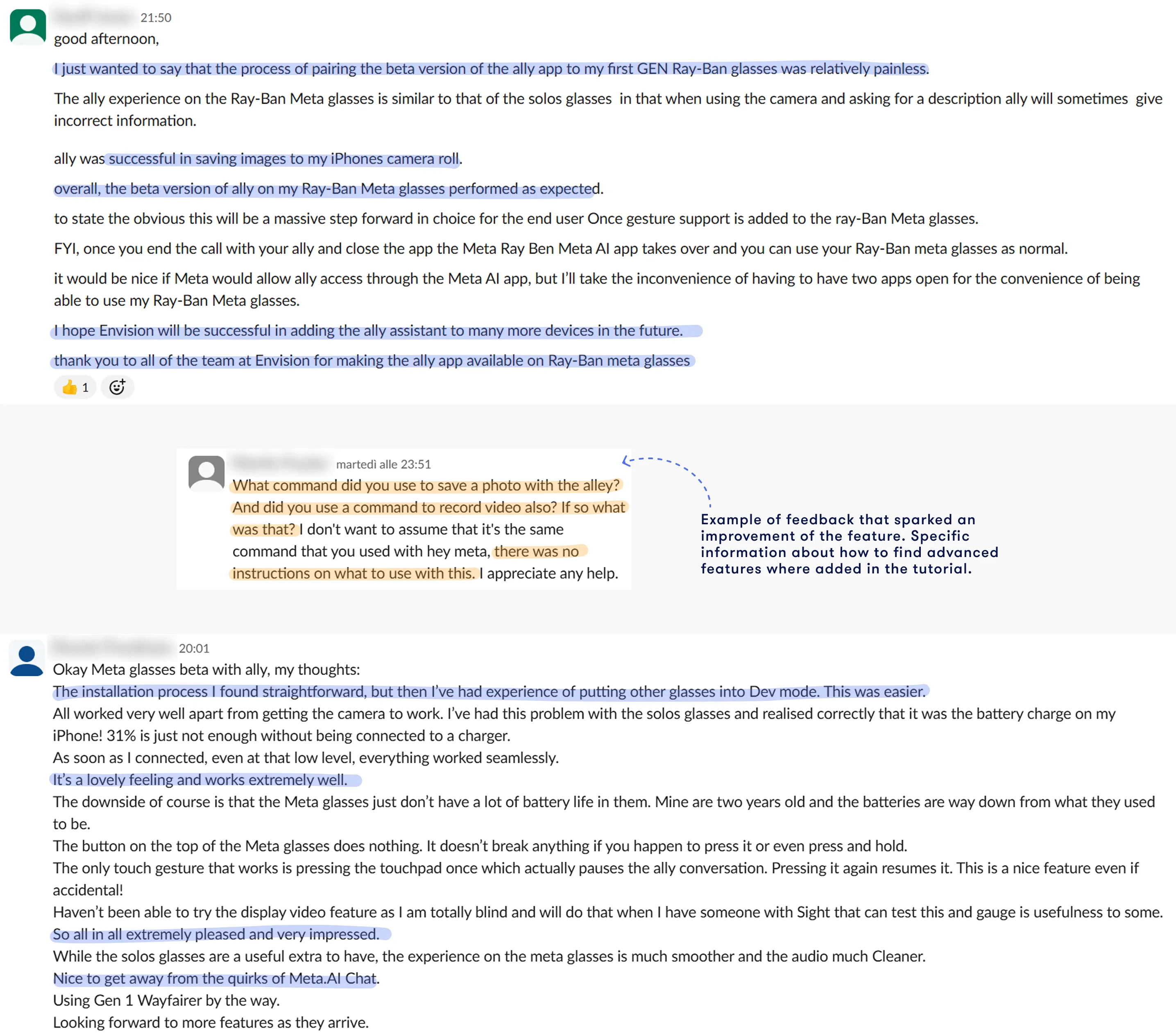
The integration was shared with a group of 600 beta testers who provided feedback freely through a Slack channel. The overall response was positive, they highlighted the smoothness of the experience and expressed enthusiasm for the integration. Where they expressed confusion, I used their input to refine the design before the wider public beta release. For example, I identified some features that beta testers were unaware of and added dedicated information about them in the tutorial.