
UX/UI of a travel app
Client: -
Type: personal exercise
Year: 2025
Type: personal exercise
Year: 2025
For my personal development, whenever I have some extra time, I like to practice my UX/UI design skills by carrying out a small personal project. In this case, I decided to design a travel app in a 5 days time frame. The idea was to create an app that supports friend groups to plan their trips together. The app can be used before the trip to organize a shared itinerary, and during the trip for quicker decision-making. The main challenge was to make sure that a full trip can be managed with one app only, avoiding having to download additional tools or create additional WhatsApp groups and shared calendars.
In the context of this small exercise, I didn't have the chance to carry out proper user research. For this reason, I started the project by taking a moment with myself to brainstorm problems and needs I encountered when planning a trip and possible solutions in form of app requirements. Afterwards, I researched already existing apps that fulfil the same purposes and identified elements to keep and elements to change.
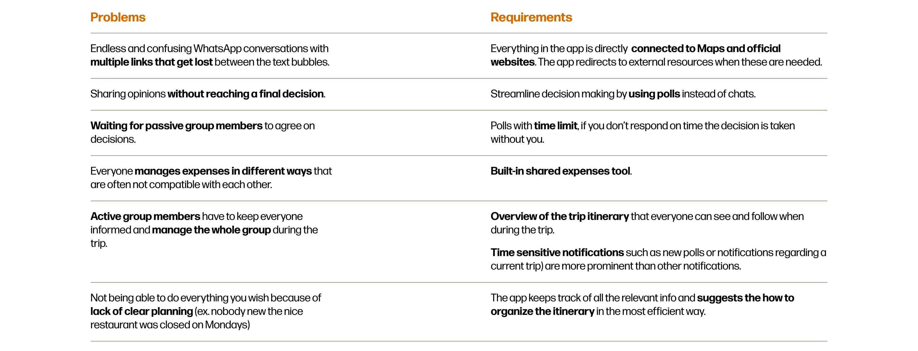
Listing problems and requirements helped me create the information architecture of the app with all the essential content of the app. From here, I jumped into creating different designs for each section and selecting the best ones to create the wireframe.
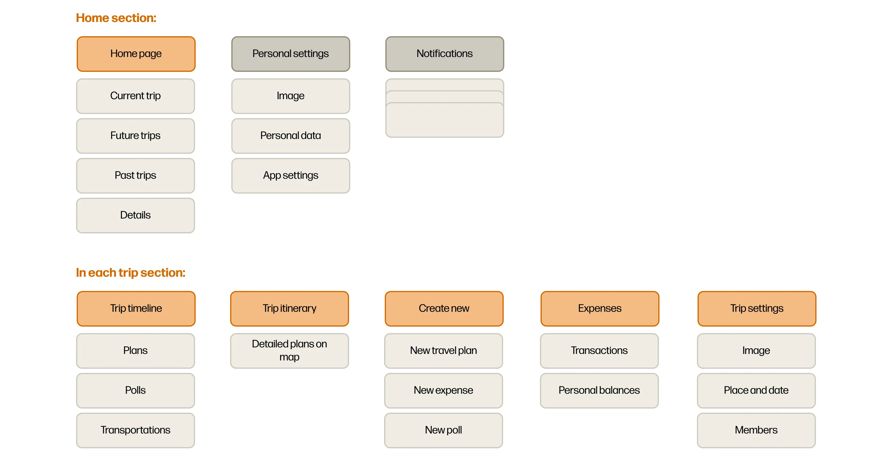
Afterwards, I focused on creating a well-explained wireframe that illustrates in detail the main screens of the app. As a result of the restricted time frame, secondary flows, such as onboarding or login processes, were intentionally left out to prioritize the core user journey.
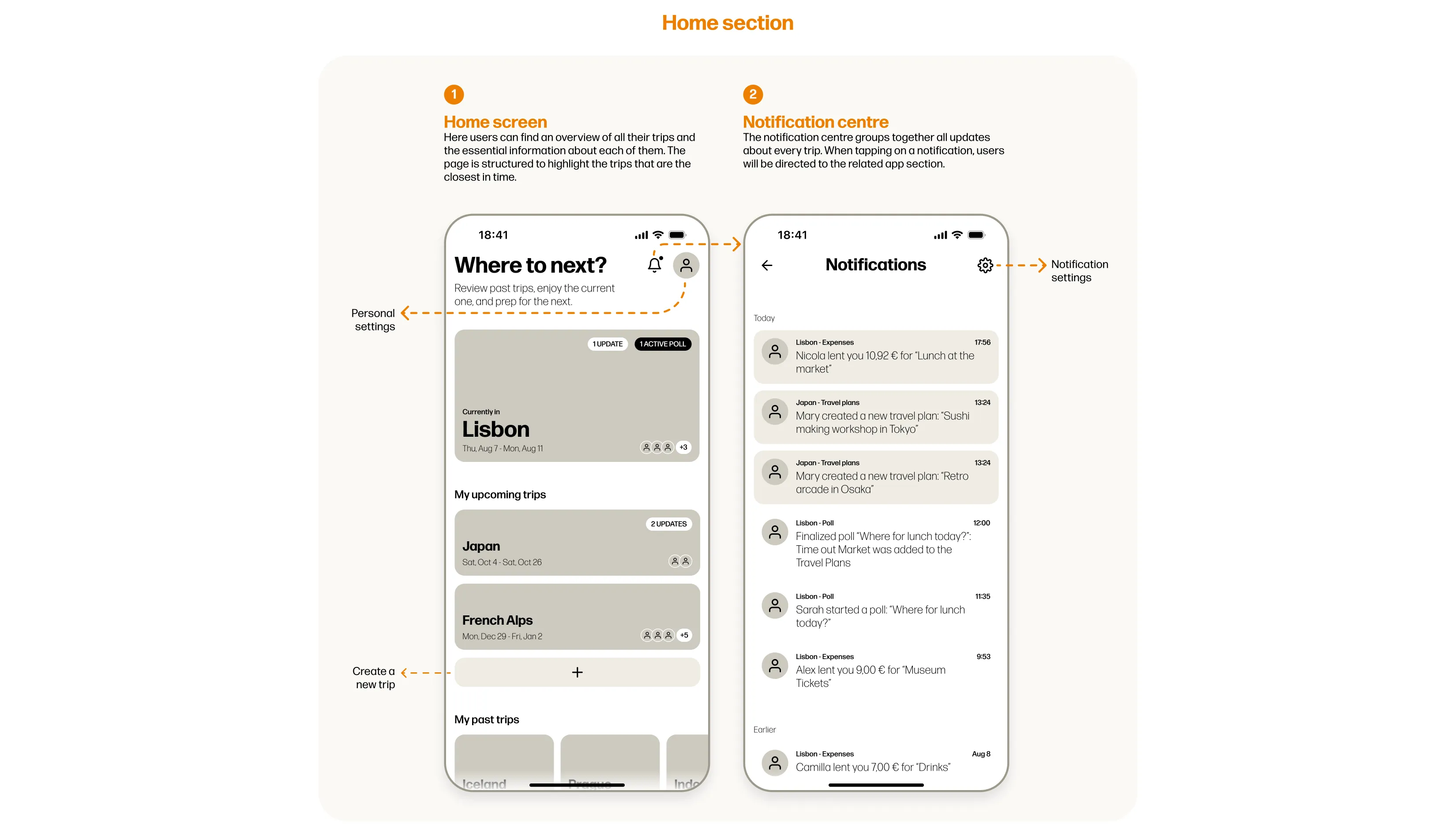
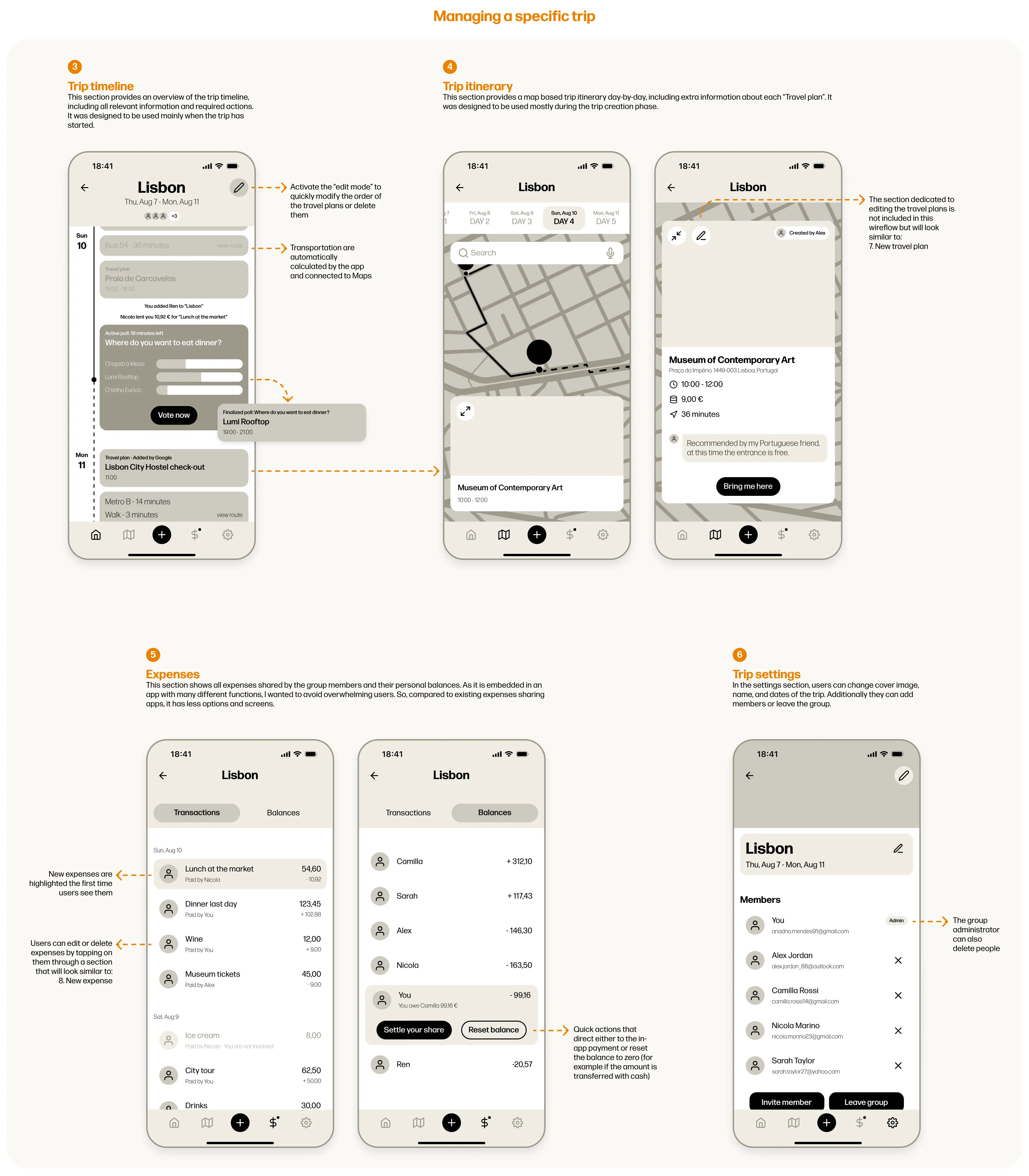
The app’s graphic design focuses on highlighting images and colors of the places that will be visited, this choice is done with the intent of putting places at the centre of the attention. The pictures in the app can be loaded by the users or collected automatically from Maps. If no picture is loaded or found, a randomly chosen color gradient will be used as background of the blocks. Because of how colorful the app can become due to the use of these colorful blocks, the background and buttons maintain neutral tones, except for the bright orange used occasionally as accent color. The app design also focuses on highlighting the group members and communicating a sense of community to stimulate them to be active and collaborate. To do so, the profile pictures of members are shown in almost all app screens. If members don’t load a profile picture, a randomly chosen illustration will be used as placeholder.
Developing a personal project within a few days was a very fun experience, as I could express my creativity to the maximum. However, taking quick decisions without validating any of my assumptions with the users was not easy. While I enjoyed stepping into the user's mind and imagining their needs, I would have loved to complement the process with user research and testing. I know that many of my design choices within this project might not be the most efficient or effective because of the limited time and the lack of user involvement. In conclusion, this experience showed me, once again, that being able to observe how people interact with the design is essential for delivering truly intuitive and user-centered experiences.